In 2017, the BLUERING brand was born and began its continuous evolution, which by 2022 will have reached the stage of a completely new image with a modern and attractive look. As part of the transformation, the brand website has been created, where both retailers and end-users can better familiarise themselves with the range.
The renewed logo reveals a clean, geometric design that can be perfectly applied to a smaller surface, whether it's a pen, eraser label or bug fixer. We've also innovated in terms of colours, from a colour-transparent, print-heavy symbol to a simpler, monochrome version that ensures easy legibility on both dark and light backgrounds.
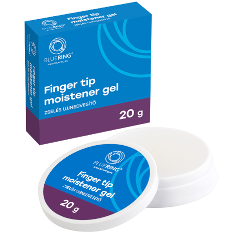
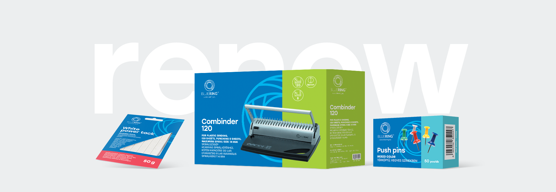
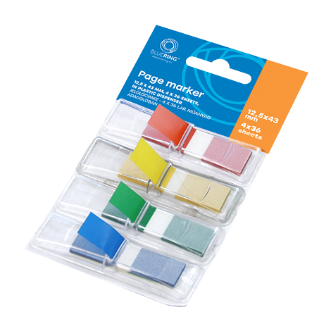
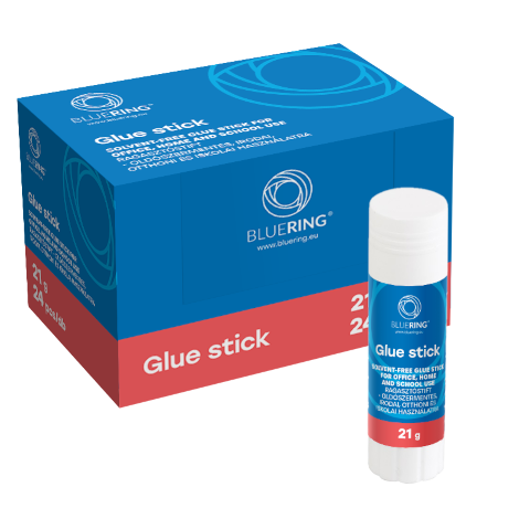
Our product packaging and products now feature this new logo. Of course, we have also aimed for consistency here: we have selected our new Pantone colours by product category, ensuring easy classification of our products and guaranteeing colour consistency.
The basic, main design element remains blue, but in a much warmer, monochrome shade, which is covered by a category-specific band, also in warm colours such as lime green, purple, orange or grey. A recurring motif appears in the background, which is a translucent, patterned geometric element of our logo.
The new design is refreshing, and the packaging of the products now contributes even more to making BLUERING products a pleasure to use, and conveys the key message that you are getting a quality and reliable office supplies range and system with the purchase of these items.
The evolution and rebranding is still ongoing, with thousands of our products changing step by step, so be on the lookout, because you never know which stationery shop you might stumble across the next new BLUERING design.